Mirror's Edge Catalyst Closed Beta: The Good, The Bad, and the Beautiful
This past weekend I was able to enjoy participating in the closed beta held by EA for DICE's upcoming game Mirror's Edge Catalyst. As a pretty avid fan of the original Mirror's Edge game from 2008, I've been keeping up with any and all news that has been made available on the subject of the sequel, so being able to get a feel for the game was great. Before I begin, I should also make it clear that I am certainly a cynic. I've listed every slight irritation I encountered while playing the game, and I don't expect nearly all of them to be addressed. Also, when I refer to "Catalyst" I am, naturally, talking about Mirror's Edge Catalyst. If I refer to "Mirror's Edge", I'm thinking of the original game from late 2008.
Major issues
I thought I'd save the best bits 'til last, so we'll start off with the worst bits. The following are issues which I feel are set to detract severely from the value of the game to players of it, and which could potentially damage sales (do I have your attention, EA higher-ups?).
Performance
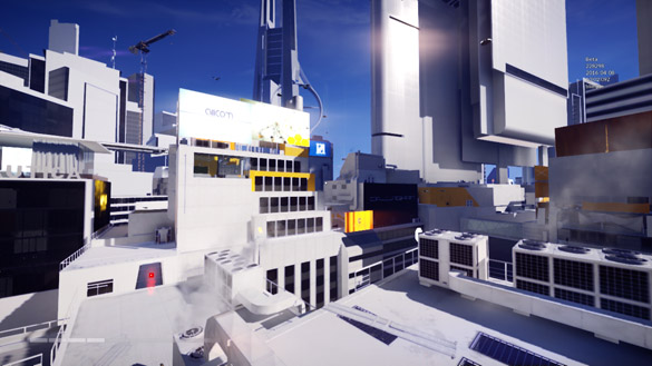
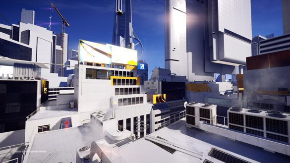
There's a good reason Valve's host of titles built on the Source engine have been wildly popular in the gaming community; Source is well-known to run playably on just about anything. Powerful hardware is not something one needs to play these games, but Frostbite 3, or Catalyst at least, is another story. My computer (full specs are at the end of the post) contains an MSI R9 380, which is a solid mid-range card. It was only released in May 2015, still less than a year ago. Sure, it's based on silicon from the previous generation, but the card happily runs the original Mirror's Edge at ultra settings without the slightest hitch. The unfortunate thing is, "ultra" in Catalyst actually doesn't look all that much better than it did in the old game. There's lot more detail, and reflections and lighting have seen quite some work, but they're not ground-breaking.
This, however, isn't really the issue. If someone isn't able to run their game at the best settings, they turn them down, right? I tried this. I ran the game at 720p rather than 1080p, effectively halving the pixel-count; I turned the settings all to their lowest; and ensured nothing was running in the background (about fifteen tabs open in Chrome previously cost me ~10 FPS in-game). In places this caused an improvement in framerate of roughly 140%, whereas in other places this was less than 50%. To be honest, I would expect a downgrade from 1080p to 720p alone to give at least a 75% boost in framerate. I also noticed clear lag spikes at times, such as when landing from a fall by rolling. I thought this could be related to the high amount of motion blur associated with this movement, but switching motion blur to "off" made no difference.
Looking at the screenshots you can see both of my points illustrated; ultra isn't all that great, and the minimum settings aren't nearly performant enough. Let's just hope that this isn't anything to do with Gameworks. PhysX was notorious for badly hurting performance of the original Mirror's Edge for many gamers.
Loading screens
Catalyst, like it's predecessor, is about running. The game's characters are called Runners, and without mistake. EA has said in multiple videos that Catalyst takes a new approach to combat and flow while moving through the city. In the original game combat was infamously clunky to many people. Typically the player would find a group of enemies, beat one of them up, take their gun, and pop off the rest of the crew with bullets. Every so often one would need to cycle over to another weapon when the magazines ran out. This form of combat arguably paused the game in a way; momentum was completely lost, and to most people it just didn't feel right. Catalyst has taken many steps to change this. Guns appear not to usable by the player. Traversal attacks also allow the player to powerfully disable enemies while not stopping for a moment, and it feels great.
Your current thought now might be along the lines of "has he added the wrong subheading?", but I haven't. The reason I mention combat and the 2008 Mirror's Edge is to emphasise this release's focus on flow and continuity, and how it's completely and utterly broken by the ridiculous loading screens. When a player stops moving for a while to fight or look around, the world carries on around them, and they're unlikely to be motionless anyway. Sitting for ten seconds staring at a still image, however, is another kettle of fish. It truly detaches the player from the game, and has a much more damaging effect on flow than the occasional need to use a firearm. What's worse is the times at which the loading screens appear. When the game first loads, go ahead and load for 30 seconds, but if I fall of a building why can't the game just place me back on top of it? Has the top of the skyscraper already been removed from memory by the time I reach the bottom? I may be using an HDD – and a fairly slow one at that – but I can't think of another game that acts like this. Interestingly, a DICE developer previously mentioned that there are "no loading times" in an interview about Catalyst, and the Wikipedia article mentions that DICE has apparently promised that "no loading screen will be included in the final game".
On a less important note, the loading screens are pretty boring. If they would only show for a few seconds perhaps I wouldn't mind, but bleached-out, greyscale stills of Faith and a Runner symbol are hardly on the same level as the wonderful silhouette combat sequences from the last game's loading screens.
Non-editable controls
I'm reluctant to even write this part, as I feel I simply must be missing something. Why can I not remap the controls? I cannot think of a single other desktop game that doesn't let me. Even some mobile games let the player move the controls, and have for a long time. If it is hidden in the menus somewhere, it needs to made not hidden in the menus somewhere.
For what it's worth, I do have a Sony Dualshock 4 connected to my computer via USB, but the game doesn't seem to recognise it at all without DS4Windows running. I doubt that the game is only showing a console controller in the menu because of the DS4 being connected, although I'm not certain I ever tried launching the game while it was disconnected.
Extreme light-flaring in some locations
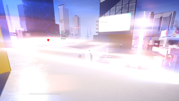
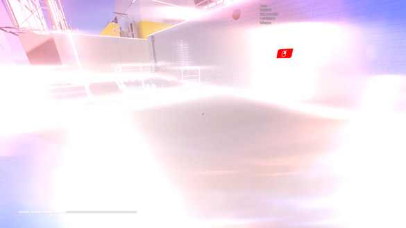
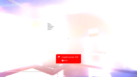
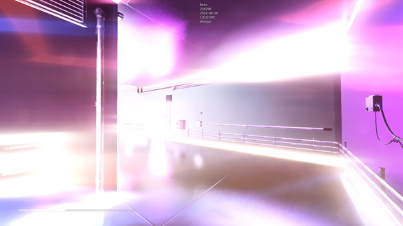
In some places on the map on occasion – not every time I visited – I was plagued by intense lighting flares. The closer I moved towards a particular point the more intense it would often get, and it could be mitigated to an extent by turning away. At points my screen was virtually all white. My guess is that it's a lighting or rendering bug that is perhaps related to some kind of day/night, or at least dawn/dusk, cycle. They say that pictures speak a thousand words, so here's four-thousand.
"Dash" event start lines
In Mirror's Edge the main story didn't really have time trials. Instead, the time trials were a separate game mode, and each was comprised of a series of checkpoints scattered around an area of the game. Each checkpoint had to be reached in order and in not a whole lot of time. Importantly, at the start of a time trial you weren't able to move until the game said "Go", after which the clock was started. In Catalyst there is a start line rather than a start point, for lack of a better word. The player can move around freely behind the line and the clock will not start. This sounds cool, as it lets the player move to the side before starting in order to assess alternative routes, but is a little different when one starts grinding the level for marginally better times, as one does.
I feel it is a bad choice. Due to both Mirror's Edge instalments having very good acceleration mechanics (rather than the usual binary run- and sprint-modes most games implement) it takes time to reach top speed. If the clock only starts when the player crosses the start line, they have the opportunity to catch a run up beforehand, and in my experience the game lets you go as far back from the line as you could possibly want. Essentially, if you want to get the best times possible on time trials it's imperative that you first turn 180°, run away, turn again, and then get up to speed to hit the line and start the clock. This gets shockingly tedious when it happens every time you restart – which is often when time-trialling – and after you've just sat through a ten-second loading screen.
I almost feel bad for listing this as a "Major Issue", but it really bugs me. In Mirror's Edge there was a roughly three-second delay when starting a time trial before the countdown even appeared, and that was infuriating enough. My ideal scenario would be like the original game, but quicker. I want to go from screwing up and restarting to moving again in three seconds. A simple, quick "Ready" and "Go!" would be perfect. After a handful of attempts you would easily get used to the timing.
Progression system
It's been stressed that Catalyst is not a sequel to the original game, and I think that this is evident after having played both, but EA must also recognise that they're using the same name as before, and the same protagonist, and the same lore. Those who enjoyed the last game will naturally gravitate towards Catalyst, and those who didn't enjoy it will not. Most of the people who will play Catalyst will have already played Mirror's Edge and will therefore already know its controls. It makes sense to teach the moves to the player during a tutorial level (which, I might add, was integrated well into the opening chapter), but don't prevent the player from using moves they've already used for eight years because they haven't "unlocked" them.
Unlocking abilities makes sense in a lot of games, but I don't think it does in Catalyst. What makes this issue much worse than it otherwise would be is simply the existence of Mirror's Edge. If Catalyst was a new IP, gamers wouldn't know how to play it already. Being taught controls you already know is one thing, but being handicapped from using them until you've been taught them again is another.
Minor issues
The following are issues that peeved me, but are hardly game-breaking. Some seem to be bugs, while others more likely design decisions. I think at least the last can be attributed to the fact that I have only played a beta version of the game.
Buttons at the top of the Tab menu
When in-game the player can press the Tab key to open an objectives-and-other-stuff menu. This "menu", if it can be called that, fills the screen. Along the top are five small tab-esque buttons that expand drastically as you hover over them. The issue is difficult to describe but if you move from left to right over the icons too slowly, they'll collapse and the mouse will be left hanging to the right of the menu entirely. Honestly, this style of menu has been done before, and on too many occasions. The best course of action would be to abandon the expanding animation, and just show all of the tabs expanded right from the beginning.
Oddities in the Player Profile
I felt a couple of confusions with the Player Profile part of the Tab menu. Firstly, is there no way to change the profile picture and cover/banner image? I don't see much point in the existence of these if they can't be changed. The default cover image also really isn't that great. It doesn't look particularly bad, but it also doesn't fit the visual style of Catalyst at all.
Secondly, what really are the ranks? I don't remember ignoring a passage of text that would have explained them to me. I understand that the more runs and missions you complete the more XP you're given, and that this is likely what decides your rank, but how are the ranks organised? There seem to be five levels, denoted by a number, but there are also several different background colours for the rank badges. What do these colour signify? I think this part of the game could do with some explaining, particularly if the developers want this game's multiplayer aspect to be successful.
Anti-aliasing (or semi-lack thereof)
Anti-aliasing is in the game, but it certainly is weird. There's no setting to change it specifically in the graphics options, and I'm not sure which of the vaguely-named options controls it. Regardless, the AA in-game is pretty lacklustre. I would hazard a guess as to say that the AA in Catalyst is just a filter such as FXAA, rather than a better technique using super-sampling or scene analysis.
Perhaps even more weirdly, the menu buttons are not properly anti-aliased. Two of the four corners of the buttons in Catalyst are rounded, while the other two corners are left at a right angle. This rounding is somewhat anti-aliased, but not nearly as well as it should be considering the fact the buttons are 2D.
Detaching from pipes and ladders
I found surprising trouble while playing when attempting to disconnect from pipes or ladders, mostly after having descended them. If I recall correctly, in Mirror's Edge pressing the crouch/slide/roll button would cause Faith to immediately let go of a pipe or ladder and fall. Pressing this key now seems to have the same effect as pressing the directional down key "S"; Faith simply slides down the pipe or ladder. This is particularly irritating when one reaches the bottom of one of the obstacles and finds the only way to get off is to jump. With pipes and ladders, the player should be able to just turn more than, say, 120° from the wall and simply walk forward to detach. Their intention would be clear enough that they wouldn't find themself letting go before it was time, and it would let the game feel a lot more natural.
Copy errors in the options
This one is truly minor. In the graphics settings menu, one item caught my eye. The motion blur option is labelled "Motion Blur Enabled". This suggests that the effect was going to be a binary on/off toggle in the settings, but instead multiple modes were added. It's a small bug, but changing the text to "Motion Blur" would help me sleep at night.
Map Legend not being mouse-navigable
In the Tab menu, the player can view a 3D, interactive, and freely-navigable map of the city. As there are with most maps, there is a key for the symbols used. Seeing as there are a lot of events and other objectives in Catalyst, the developers thoughtfully added the ability to not display certain types and keep the map a little less cluttered. I appreciate this feature a lot and it works well, but it cannot be navigated with a mouse. I was forced to use my keyboard to make any changes, which was a bit bizarre.
Personal gripes
The problems in this section are more matters of preference and opinion that the others. Although I think some issues – the first in particular – are important, I can understand that not everyone will feel as I do, and also that in an open-world game like Catalyst it's difficult, from a development perspective, for everything to be perfect.
Unrealism in odd places
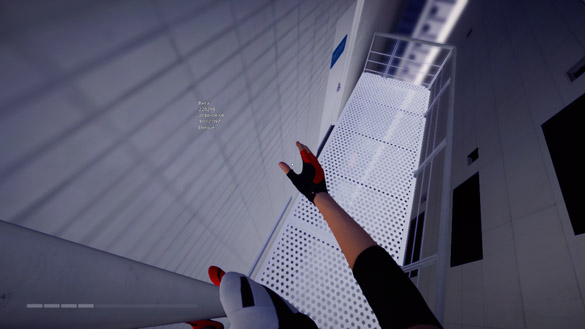
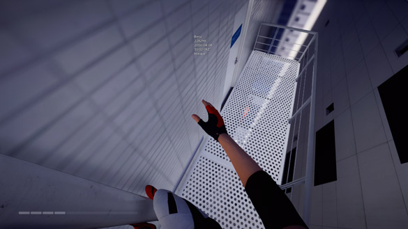
I like realism in games. That doesn't mean that I adore simulators and abhor arcade games, though. Rather, if a game advertises that the environment can be interacted with in a certain way, I like that to remain constant throughout the game. Blindingly unrealistic outcomes that punish the player or hurt gameplay are not fun. For example, in Need For Speed ProStreet rolling a car, however gently, totals it and ends the event without fail. Slamming the same vehicle into a wall head-on frequently causes less damage to the vehicle, and the race can even be continued afterwards. This kind of unrealism doesn't just make life for the player easier or harder though; it helps in one case while not in another. I would much rather the game was reasonable when a vehicle gently rolls on it's roof, but more strict when hitting walls.
Admittedly, deciding what is considered realistic in the context of the Mirror's Edge series is a little harder than for games set in the present day, but I think it's fair to say that what I've shown in the following images is indeed unrealistic (and not to mention, really annoying).
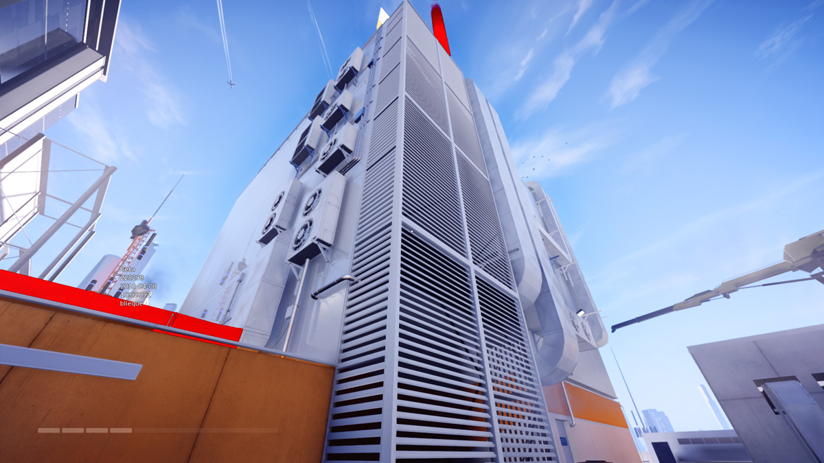
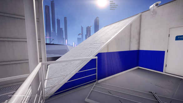
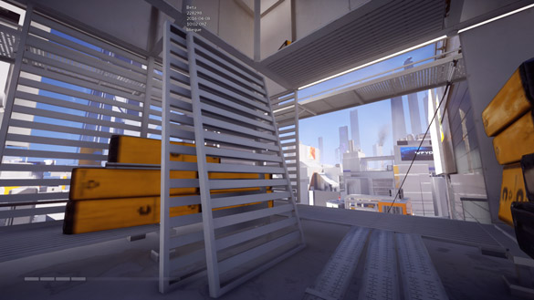
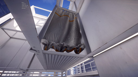
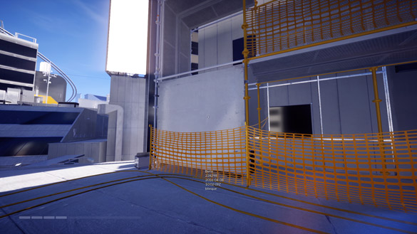
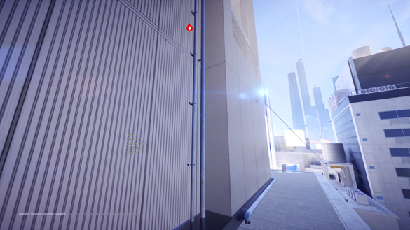
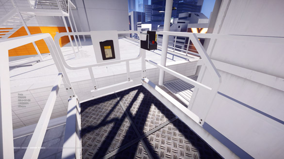
As well as the irritations that I remembered to take screenshots of, there are some others:
- In the Runner lair in particular there a number of support beams visible at ceiling height. At one point I even saw another Runner practising their balance by walking along one of the beams in the dormitory room. Can I do this? Nope; the beams appear not to be sufficiently defined in the game as things-to-be-balanced-on.
- Several zip lines, or maybe just cables, in the city can't be grabbed onto and sped down. I noticed that all the wires with surveillance cameras hanging from them suffered from this. I think in the full game players will be able to unlock magnet grapples of some kind, which can be attached to these cameras. I can understand partly why they can't be used for both movement mechanics, but ziplining down and kicking the camera off the cable would be pretty sweet too.
- The ziplines can't be climbed up at all, ever. Those with a shallow incline could totally be ascended – as well as descended – by someone like Faith in the real world, although I suppose it would be slow and could feel cumbersome to the player.
Yo, where's the tat?
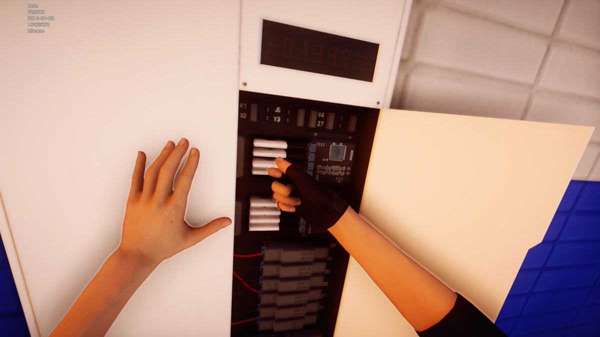
Looking down and to the right clearly shows Faith's right shoulder, but where's her iconic tattoo? There have been images released by EA that show the tattoo missing too, although there are plenty of other pieces of promotional material that show her with it. Did the feds remove it while she was in prison? That seems unlikely, but I guess I shouldn't put it past the ominous Conglomerate-with-a-capital-C.
Having watched a few videos and read a little about the game, I think the lack of tattoo is no mistake. I'm interested to know when exactly when the game is supposed to be set, but I'm wondering if Faith will be tattooed in the story (it was shown in a trailer, after all).
Repetitive sound announcements
"Scanning faceprint" (or is it "beatLink"?) is a common one; you hear it every time you run past a surveillance camera, which in a place like Glass is hardly rare. What's more, the voice says a few seconds later something to effect of "All clear, thank-you". What? Faith was released from prison and, according to Icarus, was off the grid within minutes. I'm fairly certain the KrugerSec forces know her face pretty well, and that she's a high-flyer on their to-apprehend list, so why does the camera clear her?
Another soundbite you'll hear often if you're in the right wrong place is "Master the grid, by Silvine". There's nothing particularly wrong with this one contextually – quite the opposite really – but it's just really annoying. After you've heard it a few times it's just not pleasant to hear it any more; perhaps it's that accent of consumerism.
Faith always takes the same chip
One of the best parts of the game, particularly considering that it's largely based on a free-roam model, is the collectibles system. Faith is tasked by a Runner pal of hers to collect as many chips from telecom cabinets around the city as she can. This will apparently cause trouble for AllCom, a Conglomerate business, and also help those living in the "Greylands", whom I don't think we know anything about. There are two designs of box in the game, and one of them contains eight chips, each in a cartridge. I know it's silly, but I wish every now and again she'd choose to take one other than the third from the top.
Ultra is not ultra
I mentioned before that the video settings in the options were pretty vague compared to those in some other titles, which I wasn't a fan of. I am a fan, however, of the blatant use of the word "ultra" in Catalyst, but I still have nit-pick with it. Although it didn't enable v-sync, which most gamers despise, it did only crank up Anisotropic Filtering to 8X, when 16X is available in the game. It may be small thing, but that just means it's an easy thing to fix.
The city has a name
This section definitely belongs in the "Personal gripes" section. I loved that in the original game there was virtually nothing but city. It extended as far as the eye could see no matter how far you ran, and it was mysterious. Partly because of the expansiveness and also the fact that no name was given to it, the city felt futuristic, or at least intriguing. The incredible use of bright white and strong colour side-by-side made the city feel yet more interesting and alien. In fact, when I glimpsed a dull-green hill on the horizon between two buildings, I was annoyed. It made the city seem a lot more normal and realistic, in the wrong way.
In Catalyst I was surprised to find the city had been named Glass (at least I think it's the same place). The name fits it for sure, but I do feel something has been lost. The new metropolis feels a little less romantic or fascinating and more like an accurate estimation of a real ~2070 megacity. I'm not entirely sure I'm complaining even; it's a different game with a different feel, and both are good, just maybe not as good.
Typography
Here's another particularly specific and opinionated observation. I feel the typography in Catalyst isn't that fitting. The typeface that most of the text in the game is set in is mediocre, and the typeface used for event names and such looks like more of a spacecraft-livery kind of affair. Mirror's Edge opted for a selection of Helvetica fonts, and worked wonderfully. Helvetica really is a good typeface, you know?
UI button spacing
More of a bug than anything, some of the spacing between the buttons is too little. I noticed this when looking at one of the Dashes in the Tab menu. There were two rows of buttons in the bottom right, and there was more spacing between them horizontally than vertically. Am I getting progressively pickier? It's a beta, I'm allowed to be picky.
The Standers
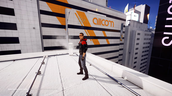
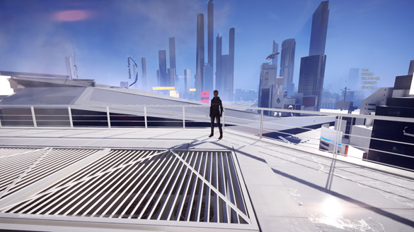
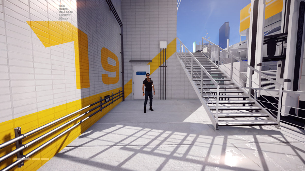
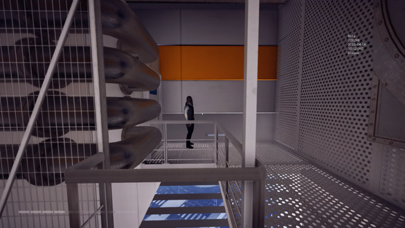
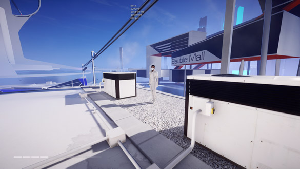
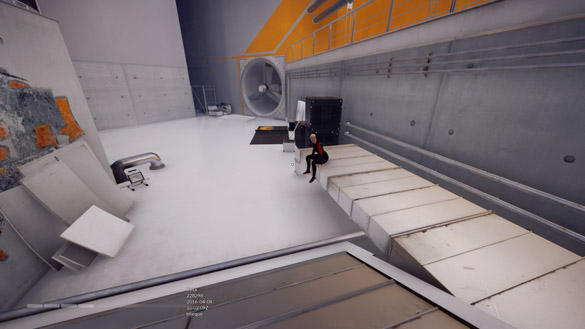
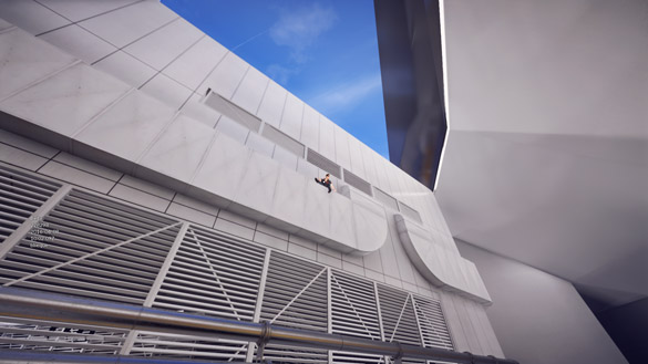
This is a name I've given them, and it is fitting. I suppose this gripe lies in a similar field to my previous irritations with realism. In Catalyst there seems to be an unsettling number of people standing around doing nothing. Although I haven't played it myself, I feel like these people would be more at home in a game like Skyrim. If one could at least talk to the characters it might mitigate the weird-factor, and if you give it some thought so many people standing out on the rooftops of the city is really odd, anyway. Let me show you:
Successes
I said that I would save the praise until last. Perhaps I have a chance at regaining some respect or love from any DICE employees reading this. Without further ado:
Visual style
Mirror's Edge was known for its bright and crisp visual style, and I'm pleased to see that Catalyst has taken inspiration but ultimately its own route. The name "Glass" says a lot; this city is indeed glassier than the city from the last game, and a lot of objects are pleasantly reflective. A much more true-to-reality colour palette has left far fewer props on the rooftops being stark white, and Runner's vision has received some very nice changes. As good as I think Catalyst will be I know it'll be polarising too, and I'm therefore thankful that it isn't attempting to repeat the iconic style from Mirror's Edge, as it could easily hurt people's fond memories of that game.
Architecture
I seem to remember the layout of the towers in Mirror's Edge being largely grid-based, which I suppose is realistic for a lot of cities, but it isn't all that interesting. The city of Glass feels like it's evolved over years, having perhaps even been a city before the prevalence of technology. There seems to be a new Shard tower, complete with two wind turbines integrated into it's structure. These turbines are just another reminder of the futurism in the game, and I dig the use of more angles and rotation throughout the map.
Sound and music
Audio is very important to the immersion felt by a player in any game, and Catalyst has music and sound effects on point. The sound of the gravel under Faith's feet is incredibly satisfying; I would be lying to say I didn't spend time walking in circles just to hear it. The music is also great, and takes a different approach to that which Mirror's Edge took, from what I've heard in the beta. I'm not sure exactly how I feel about not having heard a remix of the classic Mirror's Edge theme Still Alive; part of me would like a new take on such a great tune, but another part of me wants it to remain an exclusive gem of the first game.
Cutscenes and dialogue
I haven't play all that many games in my time but I still have a fair amount to base judgements on, and I've also watched a great many videos of games being played through. Something I've noticed in a lot of games is, what I would consider, poor cutscenes with characters who look particularly unnatural. I remember being astounded after watching videos of Assassin's Creed 3 that the characters seemed to have no sign of a tongue at all, which made their speech look completely off. Some games, such as Need for Speed: Most Wanted (the real one, not the shit Criterion one), opted for full live-action scenes with real actors, but I appreciate that this is expensive to fund and difficult in the context of the future city of Glass.
All that said, Catalyst cutscenes look wonderful. They use good camera angles, and the short videos feel natural and relaxed. Most Wanted may have employed real actors and created film-class cutscenes, but the dialogue at least still felt understandably forced. Catalyst has incredibly realistic dialogue, voice acting, and body language, the latter of which is predictably based on motion capture from actors. I can't express enough how much of a pleasant surprise these elements of the storyline were. This is the quality that should be expected from any and all so-called triple-A titles, but for the moment, at least, it's outstanding.
Collectibles
I maintain that the best game ever made is SSX 3, but I suppose in reality it's just my favourite of all the video games I've so-far played in life. One of the points I often raise to justify my love for this snowboarding action–sports masterpiece is the sheer amount of collectible items. There are trading cards, rider figurines, posters, cheat characters, boards and clothing all to collect, and that's ignoring the de-facto "collectibles" scattered over the mountain. As far as I know, there are upwards of a hundred items in each-but-a-few of the categories I listed.
What's the relevance? Catalyst, with it's collectible "Gridleaks", AllCom cabinet chips, corporate documents, room-bug recordings, and classic yellow messenger bags reminds me of SSX 3. This is a Very Good Thing. Judging by the menu there are fair load of recordings and documents (~40 each, if I recall correctly), which gives the player something do after completing the main story or while taking a break from it. These two collectibles in particular reveal little snippets of lore and background information about the city and the characters. As a example, one of the recordings lets you hear the first conversations between Noah, the head honcho of the Runner cabal, and Icarus, the young hot-shot Runner who's joined the cabal during Faith's absence in prison.
Not only are the collectibles great, some are even categorised as "Electronic Parts". Geddit? "Parts". Electronic Arts. Quality, right there.
Open-world and bookmarking
Catalyst has done something that a lot of players of Mirror's Edge wanted the original game to do; let the player freely roam the city– jumping, swinging, and climbing wherever and however they wish. I think it was a pretty natural progression for Catalyst to make, and it's been well executed. As is fairly essential in any open-world game, Catalyst has a navigation system, letting you set any of a variety of locations on the map your "waypoint". The game will then direct you towards your destination with the help of Runner vision, making your movement across the city as effortless as possible. I think there is also teleportation for some locations if that's more your jam.
One of the best parts of the navigation and locations system is that places can be bookmarked, and I think these locations are shown on your public Runner profile. This feature lets you pick locations you often visit or would like to visit more, and keep record of their co-ordinates with ease.
Street-level scenery
It may seem meaningless to many people, but I care how parts of the game in the distance appear. In a game set on the rooftops of a futuristic metropolitan paradise, the streets count as being "in the distance". Mirror's Edge peeved me slightly whenever I looked down out of curiosity, or briefly saw the street whenever I fell to my demise. The street always seemed to be drastically lacking in detail of any kind, and the cars were all the same. Although there's still only one model of car, I think, the pavements and building entrances seem to have received the right amount of attention. It always about the details.
After being prompted by a comment on reddit, I fired up Mirror's Edge for the first time in a while. Indeed, the streets didn't look nearly as bad as I had remembered them. Something I do still notice, however, is the vehicle movement. Although there is a healthy variety of vehicles, they all have a weird way of rotating around their centre rather than their rear when they turn corners. This would be easy to fix, I'm sure, but I guess it could lead to clipping. This odd driving, paired with the fact I didn't see any of the driving bugs other Catalyst players saw, probably led me to my previous conclusions.
User-generated content
I feel triple-A titles suffer more than any other type of game when it comes to having a hey-day and then pretty promptly dying off. There are always the titles that resonate with the community and go down as classics – Grand Theft Auto IV, Call of Duty 4, Star Wars Battlefront II, Portal, Mirror's Edge; perhaps – but often games don't see many gamers after having been released for a few months. Developers and publishers try the same tactics time and time again to keep games in action for longer – weekend events, DLCs, expansions, collectibles, whatever – but never with much success.
One of the most effective ways to ensure a game's longevity, in my mind, is to implement user-generated content. The more sandbox-like attributes a game possesses, the more say the players will have in the direction of the game and community. Minecraft, Unturned, and SpeedRunners have all been wildly successful to their own degrees, and all have editors in, or effectively are editors in the case of Minecraft. DICE has brought this to Faith's world, and I think the ability of players to create new time trials and checkpoint runs will be very beneficial to the community.
Summary
Despite the many issues I've managed to find something to write about, I think I'll still be buying Mirror's Edge Catalyst when it's released on June 7th, 2016. The changes that have been made to the most fundamental aspects of the game are solid, and I look forward greatly to living a part of Faith's life and exploring the city of Glass. If you're a player of the original game and you're dubious about the new, I would say to you this: Catalyst really isn't a sequel, but rather a separate entity using the same character, familiar baddies, and similar gameplay. Go in with an open mind, and you'll enjoy it much more.
Computer specs
In case anyone is wondering, my system and peripherals are as follows.
| Component | Model |
|---|---|
| CPU | AMD FX-8350 @ 4.3 GHz |
| RAM | 8 GB Crucial DDR3 1600 MHz |
| Video card | MSI R9 380 (4 GB) |
| Motherboard | ASRock 970M Pro3 |
| Storage | SanDisk 64 GB SSD Hitachi 1 TB HDD (5200 rpm) |
| Monitor | Acer S220HQL 21.5" (1080p) |
| Keyboard | Ducky Shine 3, MX brown switches |
| Mouse | Perixx MX-2000IIB |
